
Choosing paint colours for your home sounds like the fun part. And it is — until you’re standing in a hardware store holding fifteen paint swatches, none of which look anything like they did on your phone screen.
Here’s the thing: colour choice isn’t just about personal taste. It’s about the light in your home, the style of the space, and what actually works in South-West Sydney homes in 2026. Let’s cut through the guesswork.
Why Sydney Homes Are Different
Interior painting in a Condell Park or Bankstown home isn’t the same as what works in a beachside apartment or a dark Melbourne terrace. South-West Sydney homes tend to have:
- Brick veneer or rendered exteriors that influence how interior light bounces
- Large open-plan living areas that need colours with staying power across different lighting conditions
- Lots of natural light in north and east-facing rooms, which can make warm tones look muddy if you’re not careful
The direction your rooms face matters more than people realise. A colour that looks crisp and white in a north-facing living room can look grey and cold in a south-facing bedroom.
The Best Interior Paint Colours for 2026
Warm Whites and Soft Off-Whites
This is where most South-West Sydney homeowners land — and for good reason. Warm whites are versatile, make spaces feel larger, and hold up well across different light conditions throughout the day.
Top picks:
- Dulux Lexicon Quarter — one of Australia’s most popular interior whites. A clean, very slightly warm white that suits modern and classic homes alike.
- Dulux Natural White — warmer than Lexicon, works beautifully in rooms with timber flooring or warm finishes.
- Taubmans Linen — a soft creamy off-white with a hint of warmth that photographs well and ages gracefully.
Tip: What looks “white” on the card often reads as yellow or grey once it’s on the wall under your home’s specific light. Always test a sample patch first.
Warm Greiges (Grey-Beige)
Greige — the crossover between grey and beige — has been popular for years because it sits comfortably in almost any space. It’s warm enough to feel inviting, but neutral enough to not date quickly.
Good picks:
- Dulux Pebble Beach — a mid greige that works in open-plan areas
- Haymes Natural Hessian — slightly more beige-leaning, great with timber
- Taubmans Coloured Stone — a reliable mid-tone greige with cool undertones
If your home has a lot of warm timber finishes, lean towards a slightly beige-toned greige rather than a cool grey.
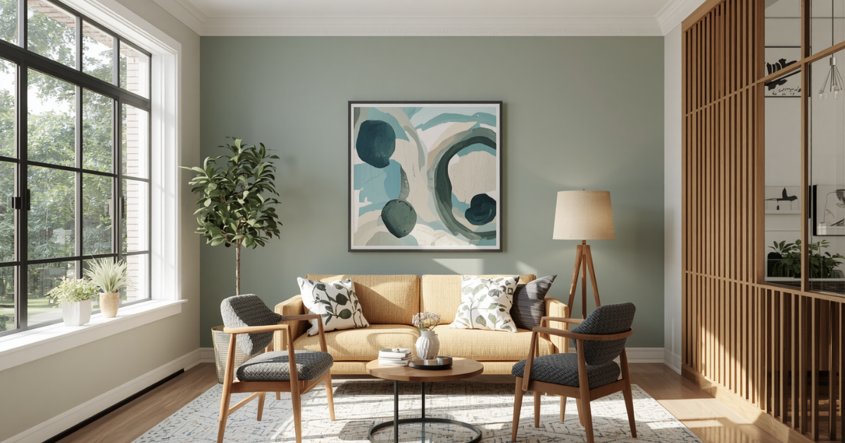
Soft Sage and Muted Greens
Green tones have firmly established themselves in 2026 as a go-to for bedrooms, studies, and even feature walls in living rooms. But not all greens work — brights and mid-tones can feel overwhelming. The key is muted, dusty, sage-style greens.
- Dulux Limed Green Quarter — barely-there green, almost like a warm white with a green cast. Works in almost any room.
- Haymes Asparagus — a proper soft sage, great for bedrooms
- Taubmans Parakeet — deeper but still muted, excellent as a feature wall
In South-West Sydney homes with generous natural light, a muted green on one wall can transform a living room without making it feel like a garden centre.
Deep Blues and Navy for Feature Walls
Feature walls are back — but done differently than the accent wall trends of the early 2010s. Today’s feature walls tend to use:
- Deeper, more sophisticated colours
- Better integration with the rest of the room (not just a random bold wall)
- Complementary sheen levels to add depth
Navy and deep blue tones like Dulux Snorkel Blue Deep or Taubmans Navy Blue work well behind a bed as a bedhead feature, or on a fireplace wall in a living room.
Sheen Levels Matter Too
Colour is only half of it. The sheen level — flat, low-sheen, satin, semi-gloss — affects both how the colour reads and how practical it is.
| Room | Recommended Sheen |
|---|---|
| Living rooms | Low-sheen or flat |
| Bedrooms | Low-sheen or flat |
| Kitchens | Satin or semi-gloss |
| Bathrooms | Semi-gloss (moisture resistance) |
| Hallways | Low-sheen to satin |
| Ceilings | Flat ceiling white |
| Skirtings and doors | Semi-gloss or gloss |
In kitchens and bathrooms, going too flat is a mistake — semi-gloss is easier to wipe clean and holds up against steam and splashes.
Common Colour Mistakes to Avoid
1. Choosing a Colour Straight from the Phone Screen
Screens are backlit and colour-calibrated differently from how paint reads in natural light. Always get a sample pot and paint a large swatch on the actual wall.
2. Not Testing at Different Times of Day
A colour can look completely different at 8am, midday, and under evening artificial light. Check your sample patch morning, afternoon, and at night.
3. Going All the Same Colour in Every Room
This creates a flat, monotonous feel. Use a core colour as your backbone, then shift slightly warmer or cooler in adjacent rooms for flow without repetition.
4. Ignoring the Fixed Elements
Your flooring, benchtops, cabinetry, and any existing furniture all have undertones. Clashing with these fixed elements is one of the most common reasons a colour looks wrong once it’s on the wall.
Thinking About Repainting Your South-West Sydney Home?
Whether you’re updating one room or refreshing the whole house, the team at Aussie House Painting can help. We work across Condell Park, Bankstown, Padstow, Sydney, and the surrounding areas.
We know these homes — the light, the architecture, the surfaces — and we use quality products that look great and last.